
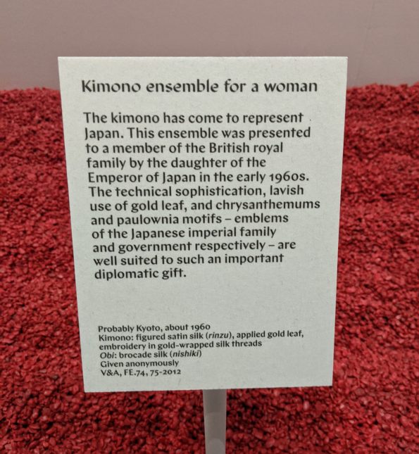
In September, I visited Kimono: Kyoto to Catwalk exhibition at the V&A that was curated by Anna Jackson and Josephine Rout. It was an exhilarating tour de force and I enjoyed every minute of it. Indeed, the 2.5 hours I spent looking, learning and so thoroughly enjoying the textiles, prints and objects on display passed so quickly that it was a surprise to find that it was lunchtime by the time we finished. Josephine generously guided both me and my colleague Dr Akiko Yano though the exhibition. This meant, of course, that I benefited hugely from their considerable expertise. Going through an exhibition or gallery with a knowledgeable guide is such a privilege because it gives you the opportunity to ask questions, especially about material with which you may be unfamiliar - as was the case here - while also chatting and sharing insights.
As with all of my exhibition photo galleries, this isn’t a review, simply a place to share the photographs I took and my thoughts while enjoying the displays. I have divided each gallery according to the section of the exhibition the material was displayed within as I remember it, so there may be some discrepancies. Feel free to use or share them, I simply ask you to attribute them to me.
The entrance
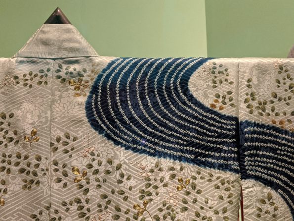
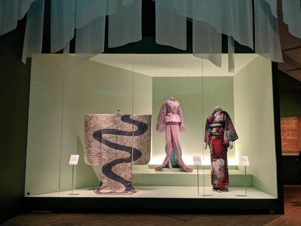
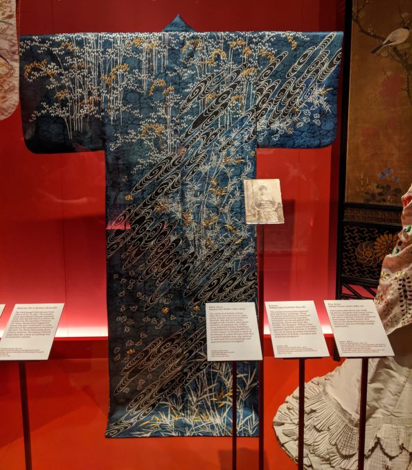
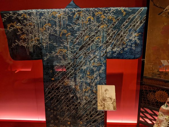
This section contained the kimono that spoke to me and which I loved the most: a stunning cream creation with a blue and white river of shibori rippling across the back. Also, a pink Galliano for Dior two-piece inspired by the shape of Christian Dior’s New Look jackets combined with the cherry blossoms and kimono of Japan. Heaven in an outfit.

Introducing the kimono
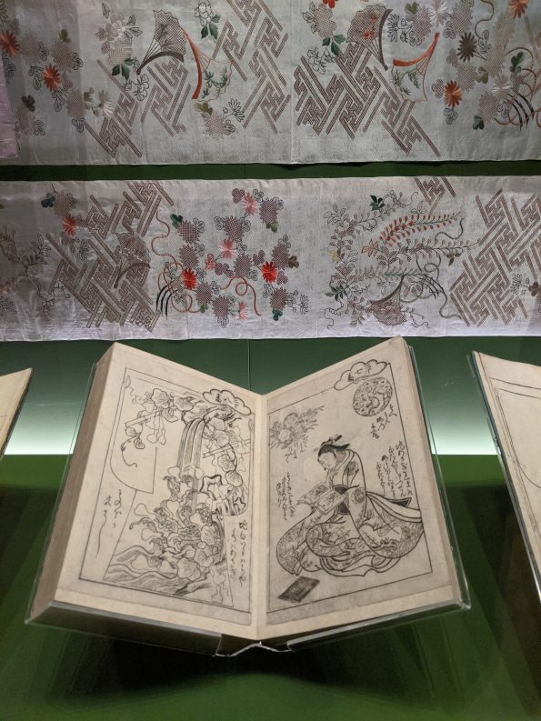
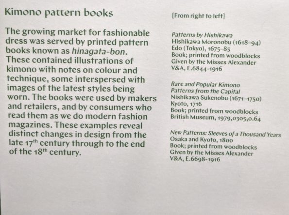
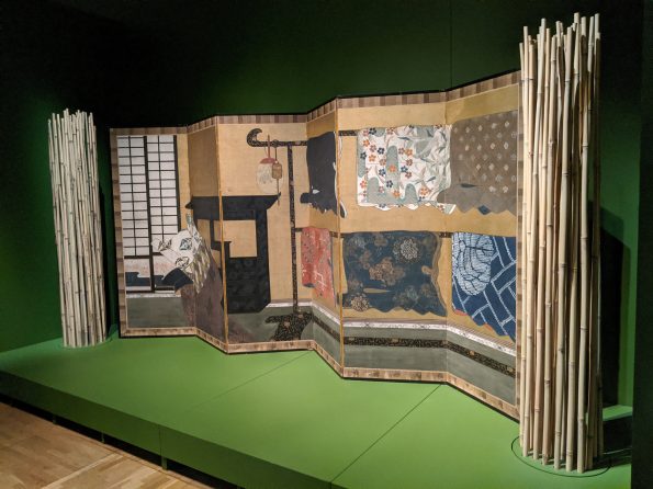
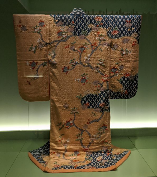
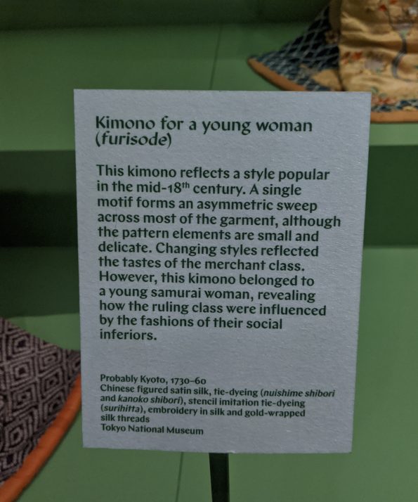
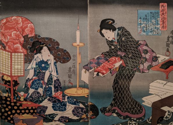
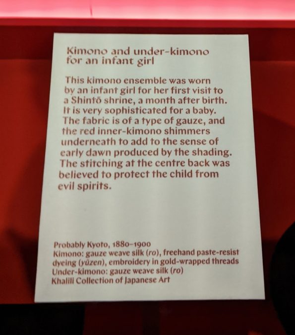
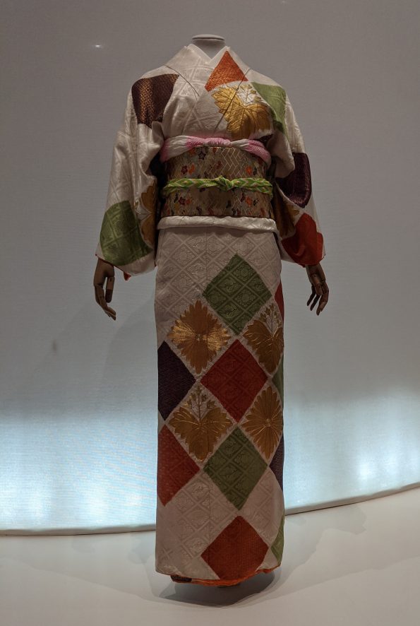
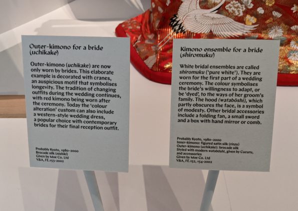
Here, we were introduced to the idea of the kimono: how it was manufactured, how men and women selected the fabrics to make their kimono and the various textiles and embroidery permitted for each social group. The stunningly embroidered panels on display were brought to life in a video that helped visitors to visualise how they were sewn together to create a kimono. Previously, I had no idea kimono were made up of so many different pieces of fabric: I had assumed only one or two pieces were used in their manufacture. How wrong I was! It was a real experience to see the kimono pattern books (one of which was on loan from the British Museum) as well as prints showing women selecting fabrics and trying on kimono in shops. Perhaps my favourite piece in this section wasn’t a kimono but a screen painted with a variety of kimono hanging on rails. I loved the idea of someone changing into a kimono behind this screen, perhaps one of those depicted on the other side.


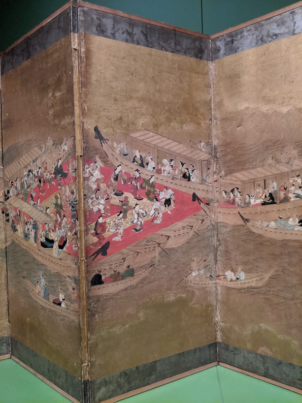

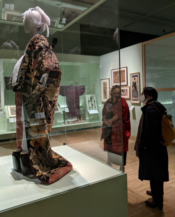
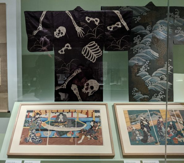
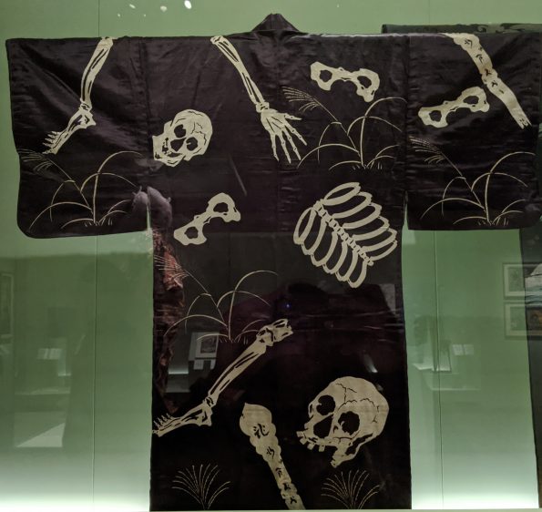
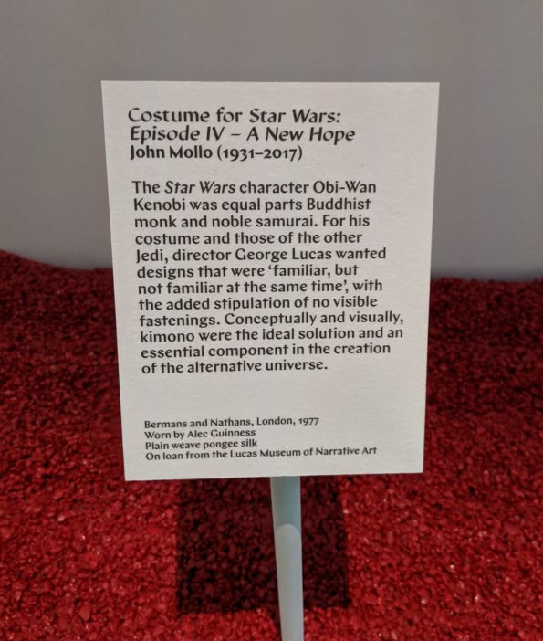
Courtesans, Kabuki and Floating Skeletons
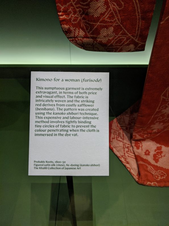
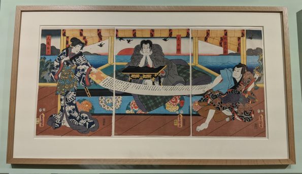
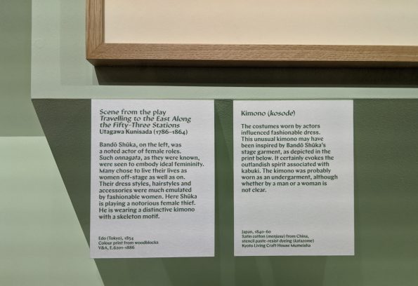
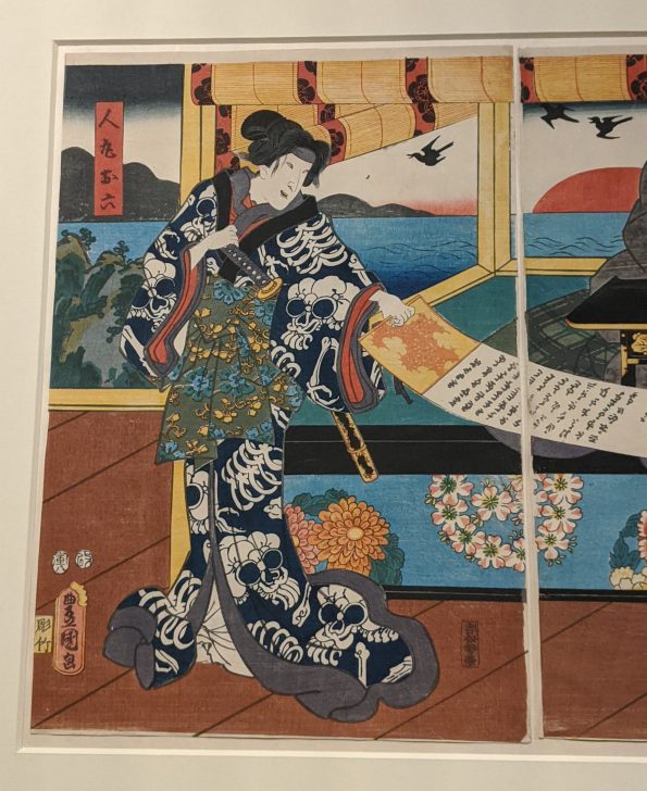
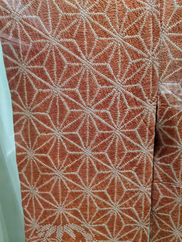
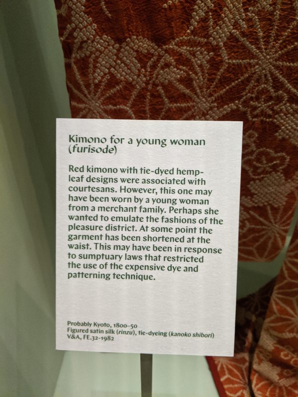
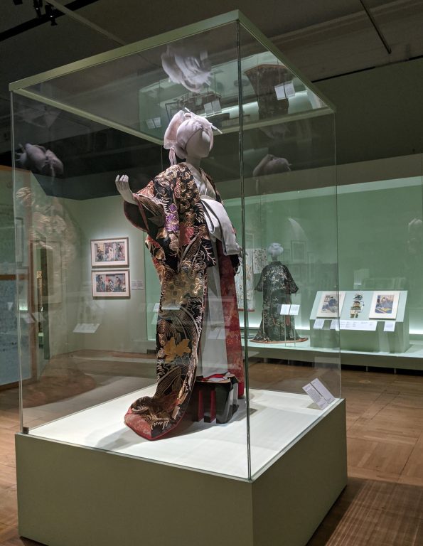
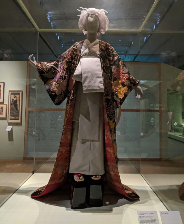
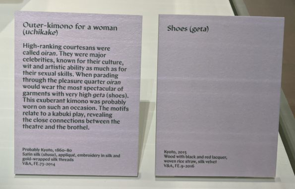
This section really opened my eyes to the sheer variety of kimono created for different people and purposes. The courtesan’s costume in the central case was eye-wateringly gaudy even for me, and I’m all for a ‘more is more’ approach. The section focusing on kimono and prints associated with Kabuki actors was more my speed. Why? It had an unexpected brush with the macabre with a black kimono bearing a dismembered skeleton floating across the fabric. Below this fabulous costume was a print in which a woman wore a kimono with a similar design on it. But, it wasn’t her that caught my eye; it was the man with his face in his hands while two people unrolled a lengthy scroll before him. His expression was something to behold. We’ve all been there! Also, the skill required to create the shibori in a geometric, hemp-leaf pattern on the red kimono was simply awe-inspiring.
Checks galore and a peeping detail
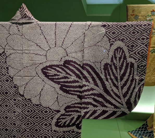
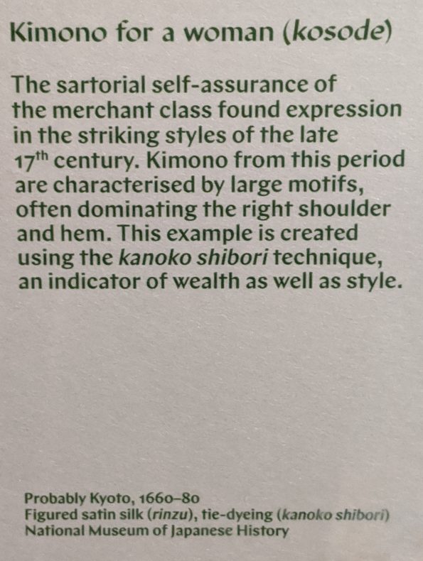
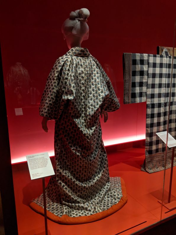
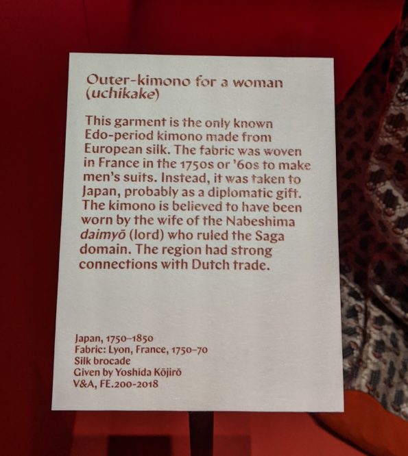
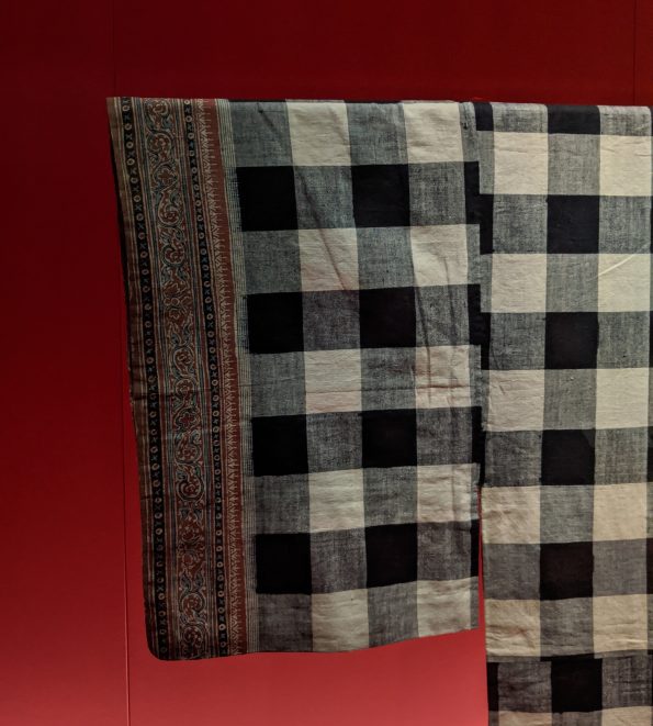
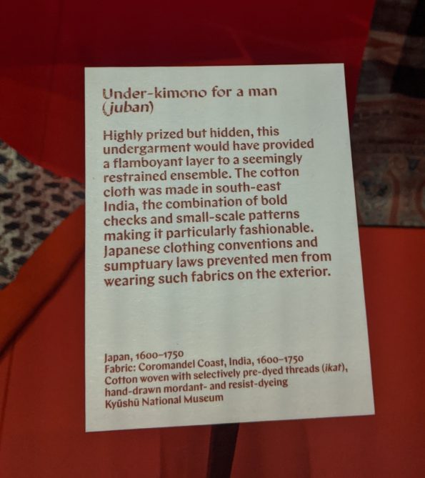
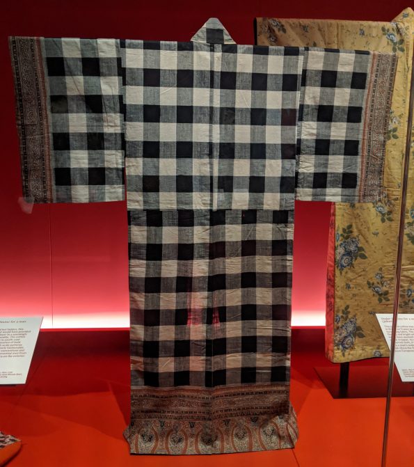
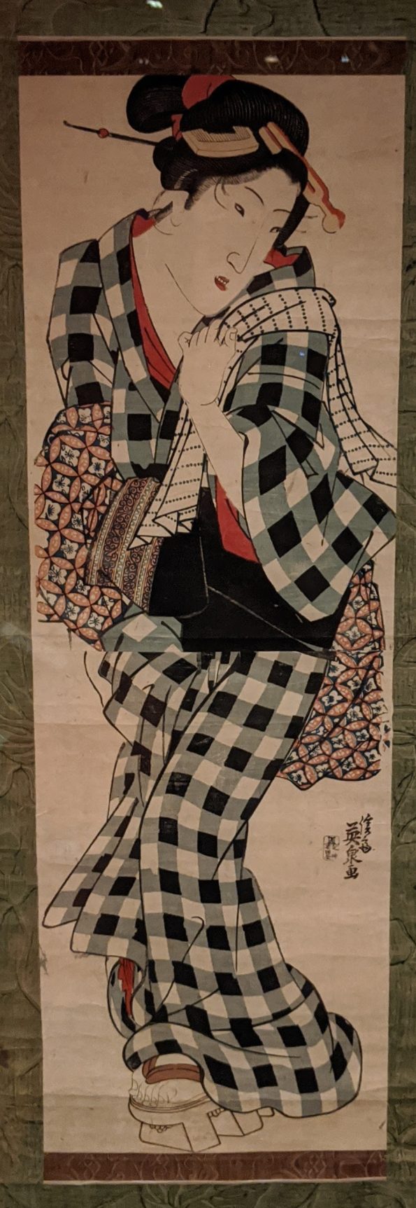
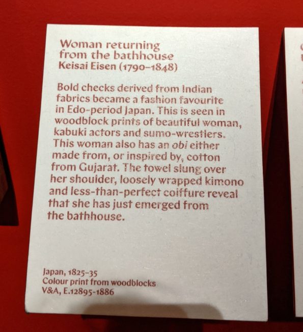
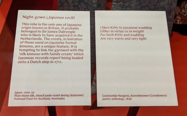
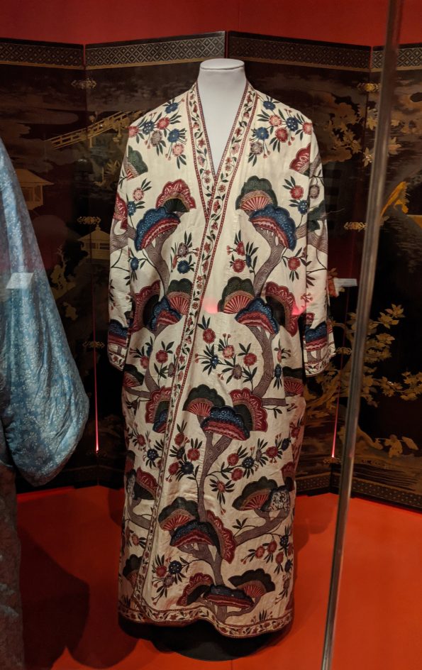
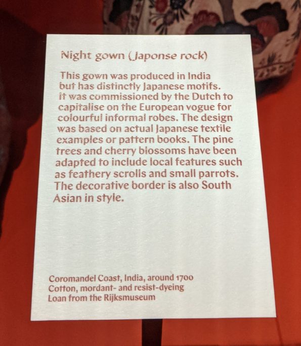
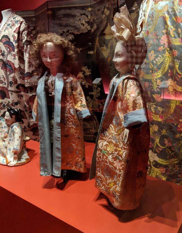
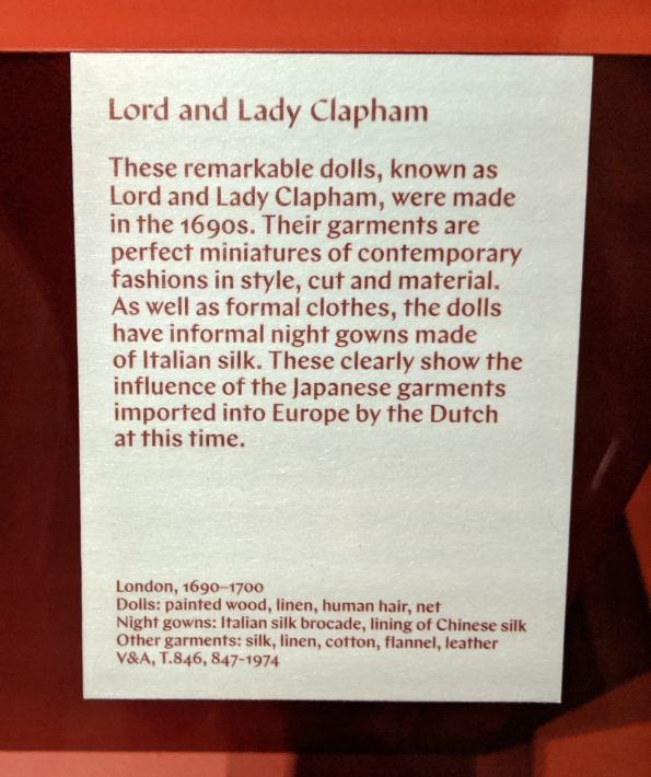
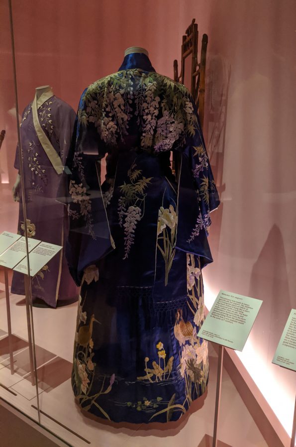
I think I may have conflated a couple of sections here, then again I might not have… Either way, this was a fascinating section for so many reasons. The shibori patterns that I had seen on my journey through the exhibition brought to mind traditional Gujarati bandhani and I wondered if the Japanese ever incorporated Indian textiles - whether bandhani or any others - into the production of their kimono because the result would be really interesting to see. In this part of the exhibition, my wish was granted: there was an example of a man’s traditional under-kimono made using 17th/early 18thC checked and hand-drawn mordant- and resist-dyed fabric from the Coromandel Coast. Look closely at the sleeve: the woven checks and dyed pattern is all on one piece, rather than two separate pieces sewn together. I loved the idea that this fabulously flamboyant garment would have been worn underneath a more subdued kimono, reminiscent of Ozwald Boateng’s suits with their unexpectedly colourful and jazzy lining. My husband has a couple of his suits and while the cut and style are exceptional, it is the lining that I love the most. Nearby, it was a joy to see a check-fabric kimono worn by a woman emerging from a bathhouse, but, not only this, her obi is made from - or, according to the label, perhaps inspired by - Gujarati fabric. At the risk of channeling the character played by Sanjeev Bhaskar in Goodness Gracious Me who is adamant that everything and everyone, from Shakespeare to the Queen, is ‘Indian!’, seeing this small piece of Gujarat in Japan made me smile.
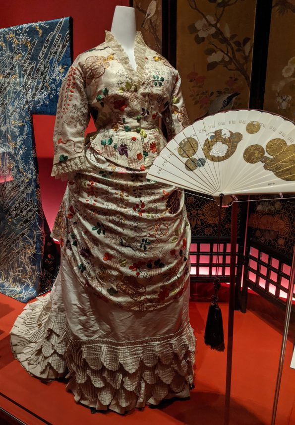
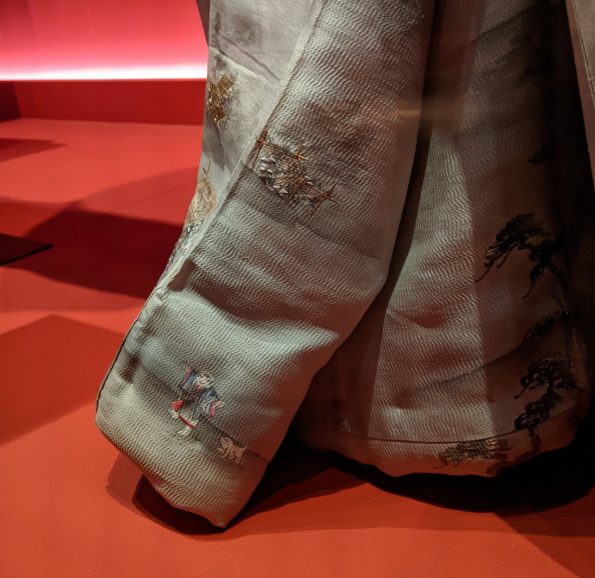
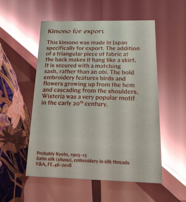
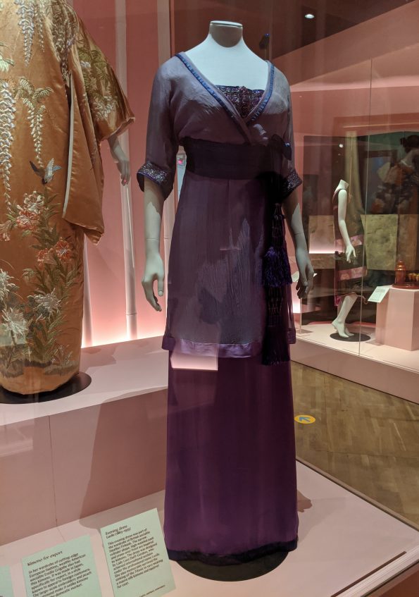
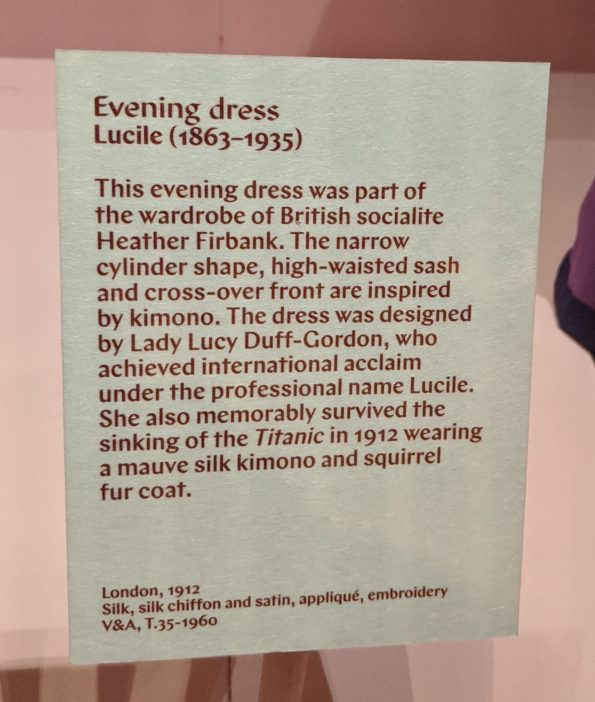
While the European gowns made from kimono fabric were interesting to see, it was a small detail that Josephine pointed out on the hem of a grey, silk kimono that I would otherwise have walked past, that made my jaw drop. If you look closely at the 8th photograph from the end of the gallery below, you’ll see a tiny, hand-painted detail of a man walking along with a small, white dog following him. This was part of a longer scene that could only be glimpsed as the kimono hem swayed open and closed with the movement of the wearer.
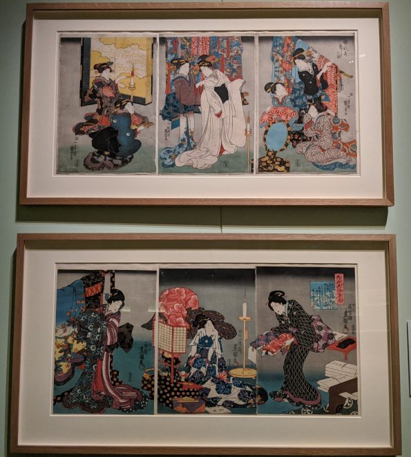
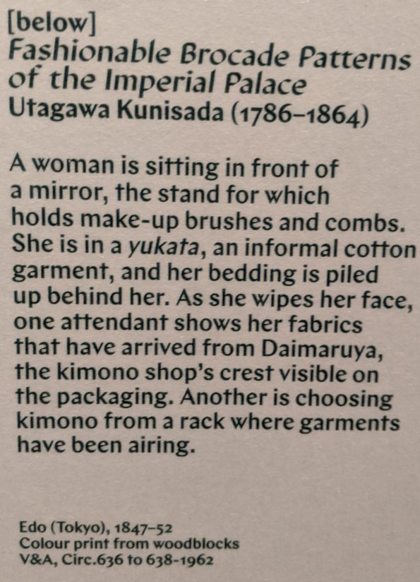
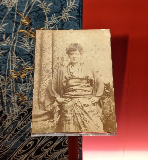
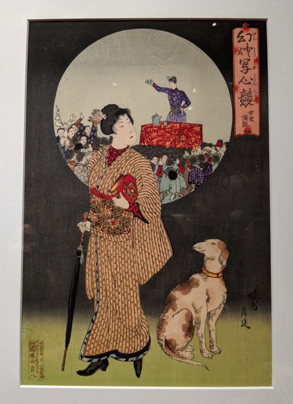
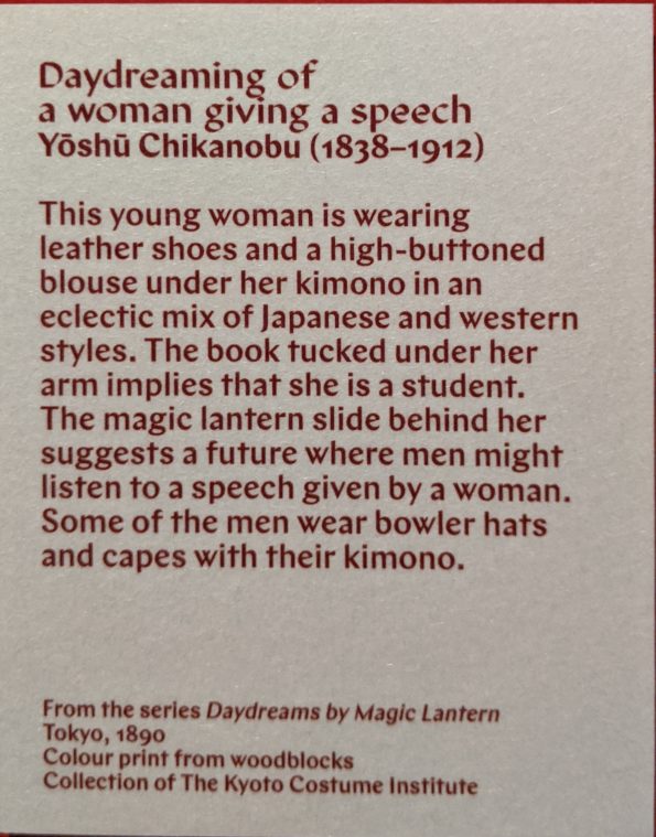
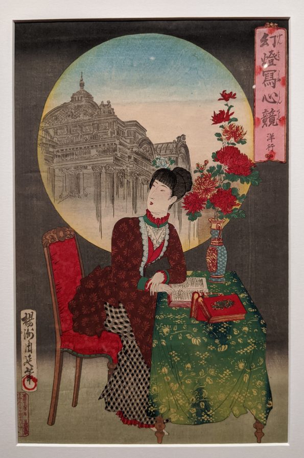
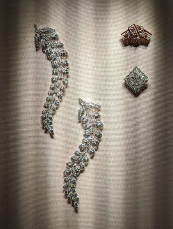
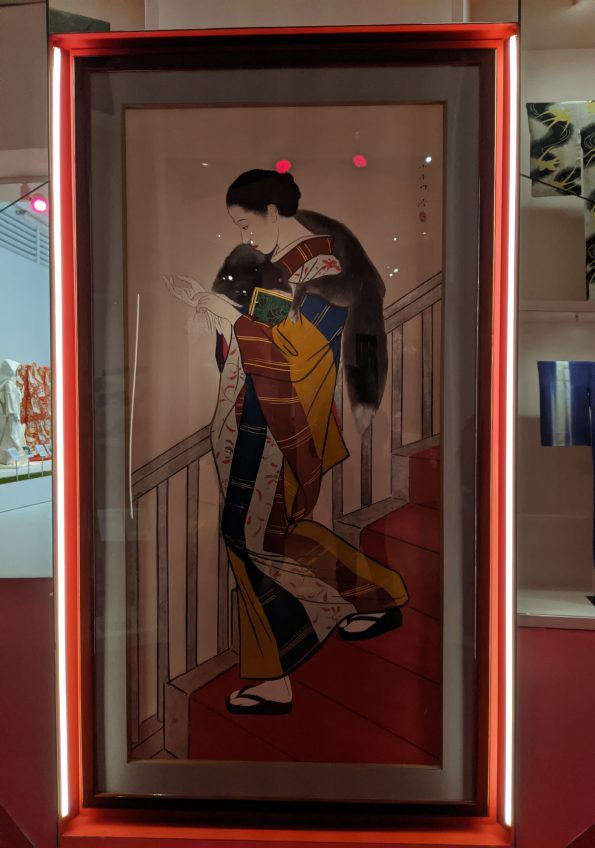
Lastly, two prints made me stop and look more closely because they reminded me of a departmental meeting when a colleague, Prof. Nicole Rousmaniere, presented a collection of kimono that the museum later acquired. Among the photos of the textiles were some images of 19thC or early 20thC Japanese men wearing traditional English Morning dress complete with top hats at their weddings (at least, I think it was on their wedding day; this was some years ago so I may be misremembering) while their wives wore kimono. It was reminiscent of photographs of Indian men and women, whereby the men wore English clothing, often in combination with items of Indian dress, while their wives wore traditional, regional Indian clothing. The late 19thC prints in the exhibition were different: here, the women wore or carried some aspects of European clothing, whether shoes or an umbrella, or were dressed in the whole shebang. The images also incorporated European books, furniture and, in one case, even a pet dog. The visual details and text in the prints provided additional information that revealed that, in one case, the female student was daydreaming that she might give a speech to which men would listen. In the other print, the woman was thinking about foreign travel, something that the Japanese were now able to do after some two centuries, and, in a moon-like sphere behind her, there is an image of a fantastical confection of a European-style building that is part Crystal Palace and part every-other-type-of-Classical-architectural-style brought together. I thought they were marvellous because, like the kimono made from imported fabrics, they brought me into the realm of ideas, hopes, dreams and everyday life of people who lived on the other side of the world… and, you know what? They were very similar to my own.


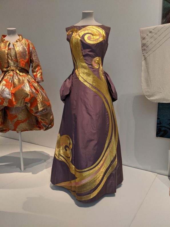
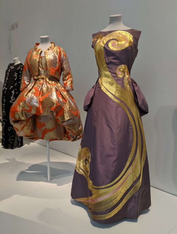
Simplicity and extravagance
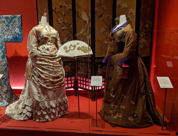
After the rich red background of the previous sections, we now moved into more subtle shades of pink: first a deep blush and later, in the next section, a paler pastel shade. While the temperature of the colours might have cooled, the content remained upbeat and dazzling. One of my favourite pieces here was perhaps the simplest: a deep yellow mantle created by Poiret comprising two rectangular panels of woollen fabric. It anticipates so many contemporary approaches to fashion, both high street and catwalk. I spent a long, long time looking at its construction and elegant drape and wondered if I might have a go and making something similar, albeit without the bow which I find too fussy. The thing is, often the apparently simple garments are the most challenging to attempt, especially when they are made in a plain, single colour fabric that shows up every single error you make. Something a little more complicated with, say, pleating made in a printed fabric is considerably easier to sew because you can hide all those mistakes you make along the way. Also, the fit with a ‘simple’ gown has to be spot on. In a mantle like this one, if it is too big, it will look like a sack; if it’s too small, it’ll make you look like a potato. Maybe I’ll stick with making my trusty t-shirts and pencil skirts for now.
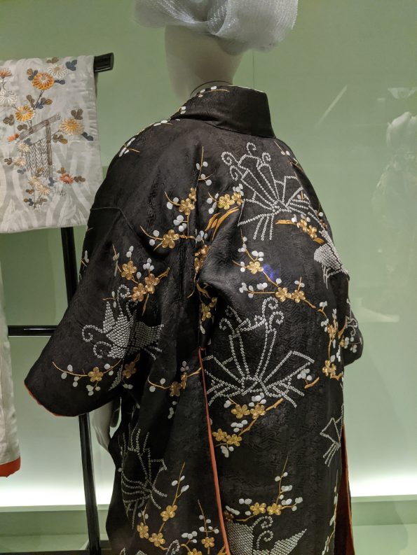
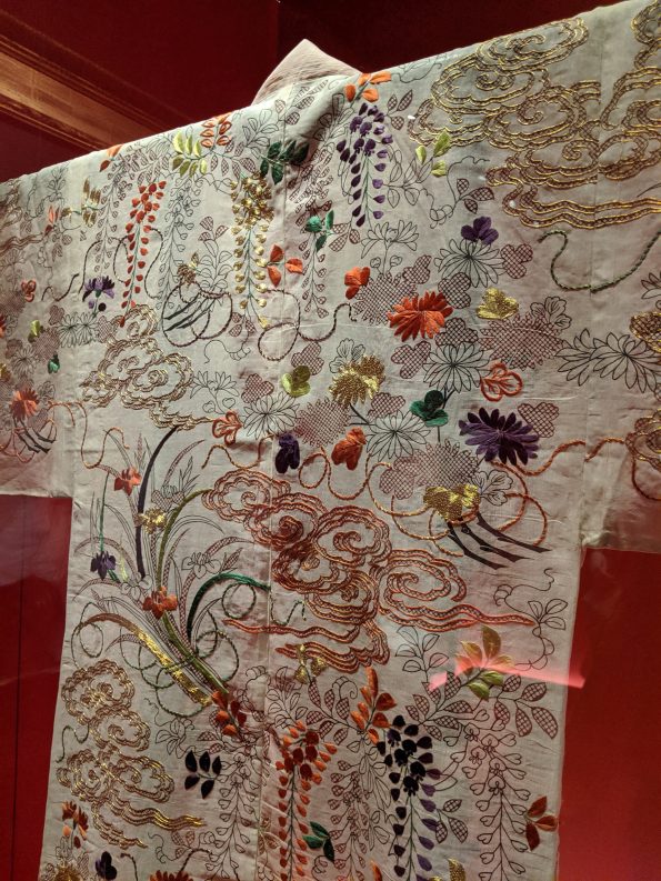
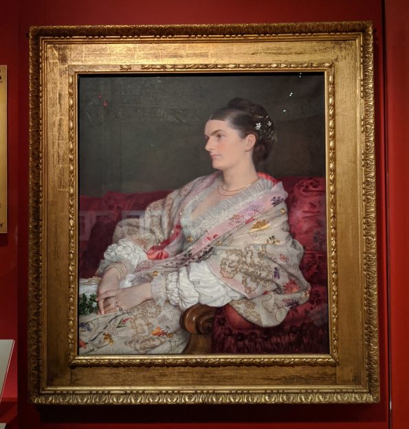
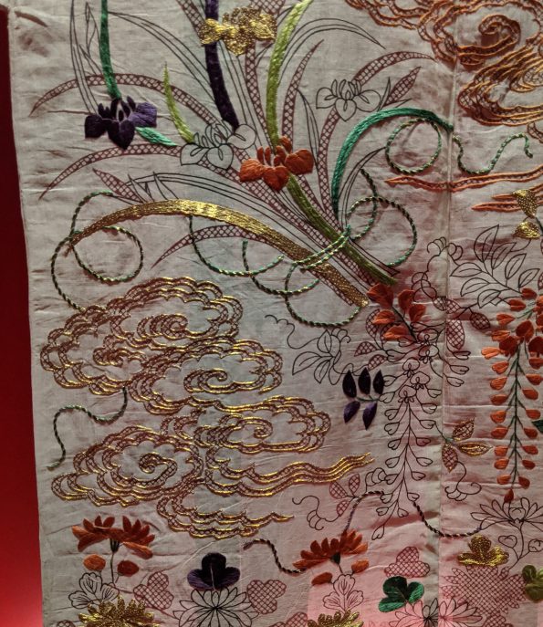
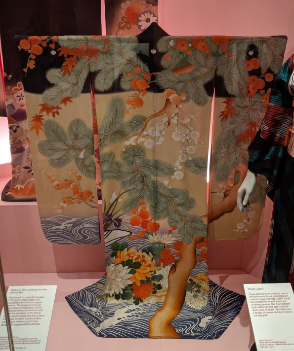
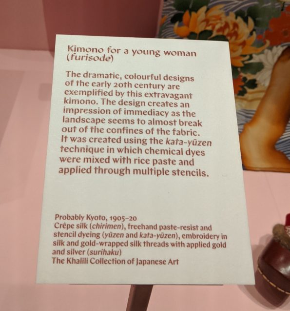
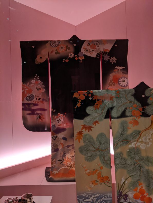
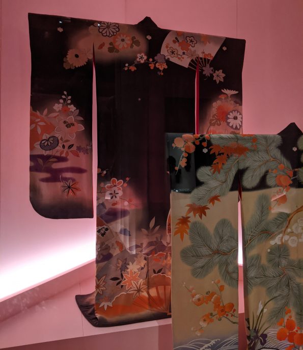
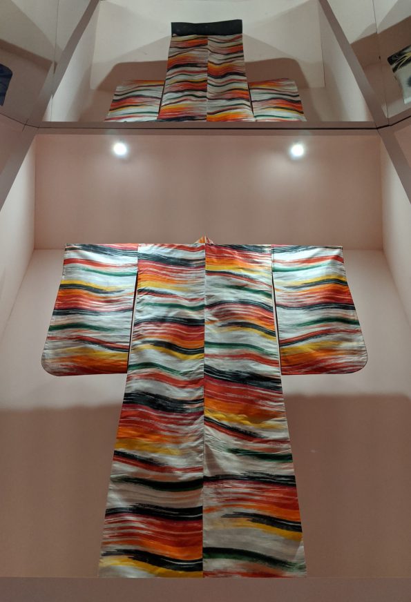
Another example of apparent simplicity that disguises complexity was the display of floral silk kimono. These were the Japanese fabrics depicting landscapes and chrysanthemums with which I was most familiar and I had always assumed they were simply printed. When I asked Josephine about them, I quickly recognised my error: these fine silks were hand-painted, stencilled and then embroidered with silk, gold or silver wrapped thread. So, not very simple at all! Although they were hung on frames because they are so delicate, you could imagine how these kimono would drape over the body and move with the wearer. They were sublime. Interestingly, it was in this section that I came across the type of photograph I mentioned earlier: a man in European clothing and his wife wearing a kimono and associated accessories. If there was one kimono I could take home with me from this exhibition, it would probably be the black one with flame coloured flowers at the very back of the display.


The unexpected
The kimono here presented a refreshing contrast to the earlier sections of the exhibition, in which the overall focus was on dramatic, beautiful, sophisticated kimono into which hours and hours of labour and oodles of expense were poured. These were different and brought home to me just how important kimono were both for everyday life and those special occasions that marked key moments in a persons life. The section was introduced by a life-size painting of a young, fashionable woman in 1920s Japan. In fact, I was surprised that I could identify it immediately with the 1920s given that I know very little about this period in Japanese history, art or culture. But, there you go, 1920s is 1920s.
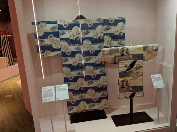
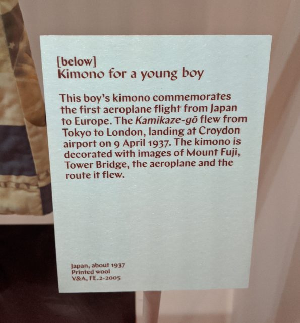
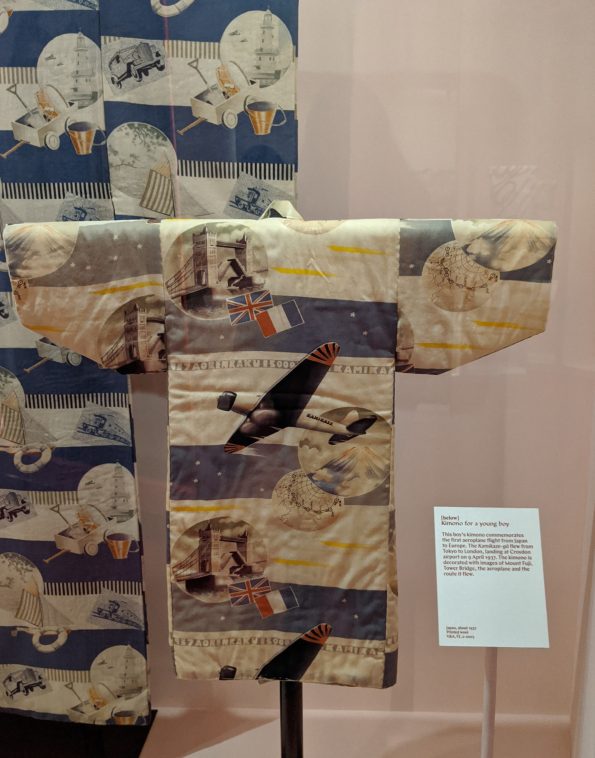
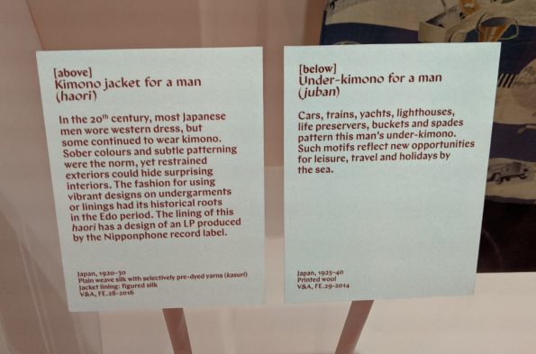
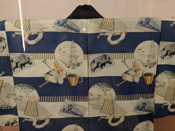
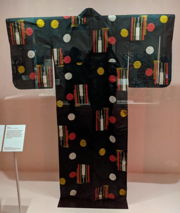
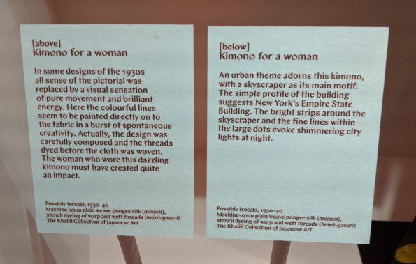
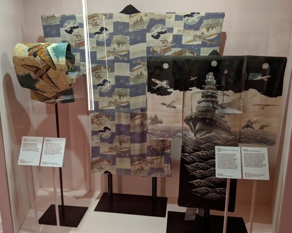
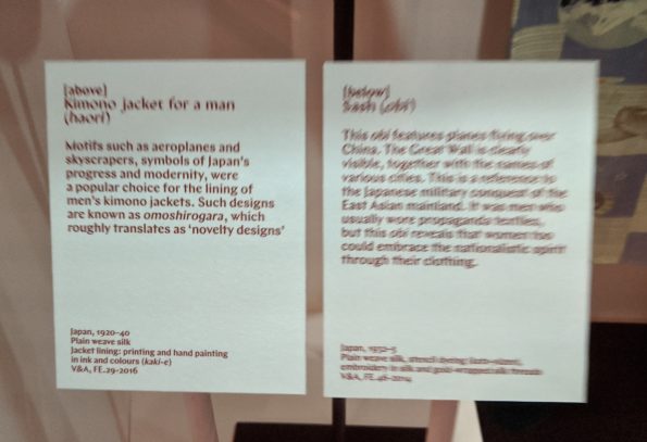
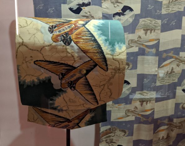
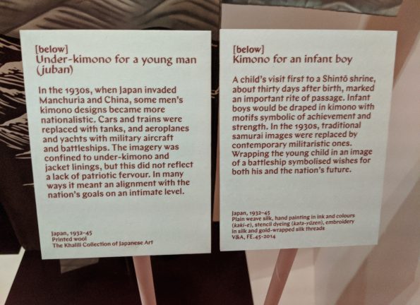
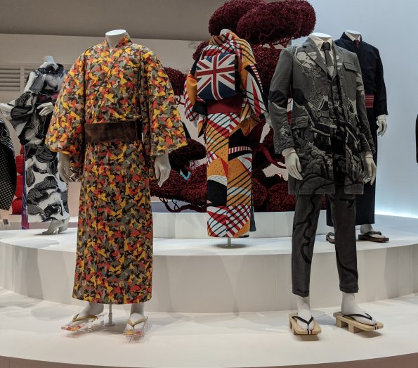
Some of the pre-WWII kimono displayed here were printed with unexpected scenes of lighthouses, buckets and spades, Tower Bridge, sky scrapers, aeroplanes and motorcars. Others were woven with vivid bursts of colour that would have looked spectacular when worn. Chatting to Josephine, I learned that in the run-up to Japan’s entry into the Second World War, kimono and obi for men, women and children increasingly depicted martial motifs, including battleships and warplanes and some of these were on display. A very clear illustration of contemporary events and propaganda influencing everyday sartorial choices. I found these quite unsettling: after all, it is one thing to see such images on posters or television, but, surely, quite a big step to wear them so prominently on your person or in which to dress your child.

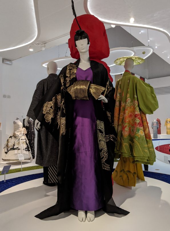
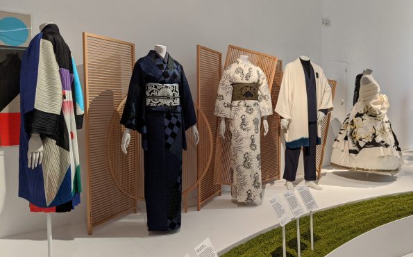
Present-day
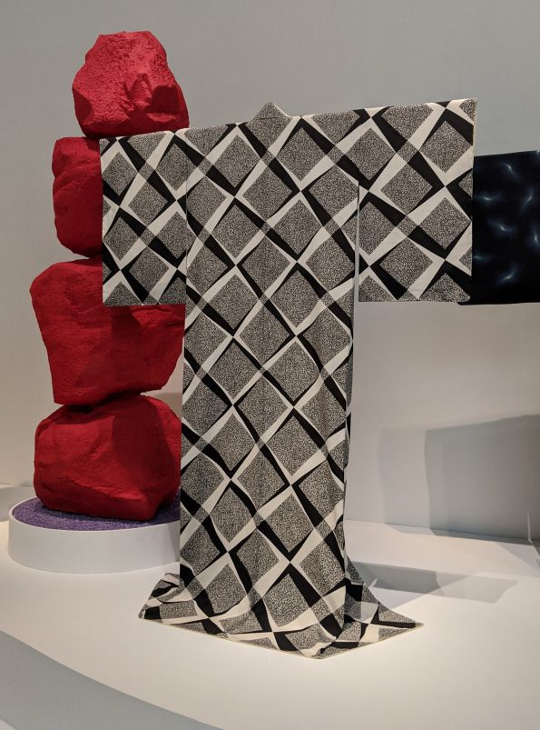
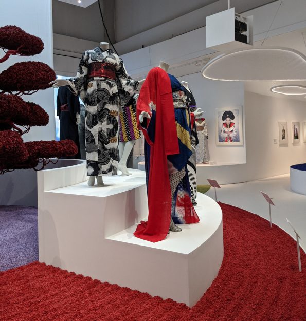
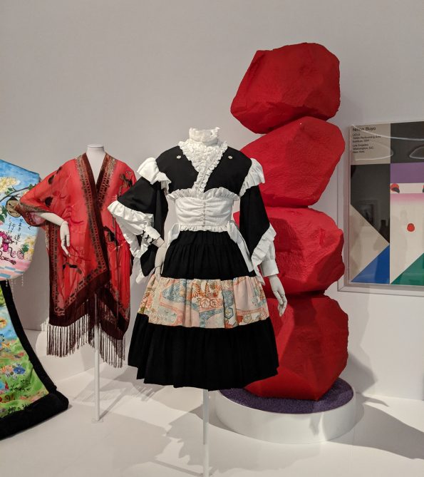
Here, I found myself catapulted into the present-day, surrounded by bright white walls and red, combed pebbles, reminiscent of a traditional Japanese rock garden. The overall aesthetic and placement of fabulously dressed mannequins reminded me of the final extravaganza of a previous fashion exhibition at the V&A: Dior.
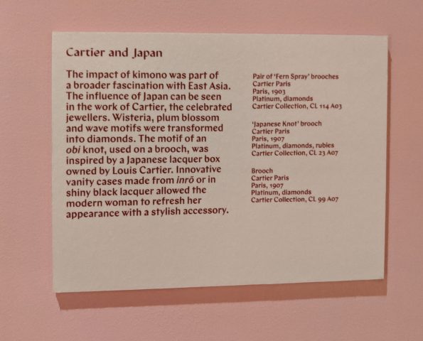
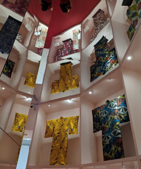
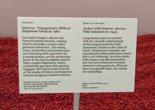
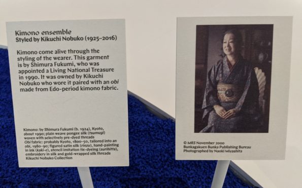
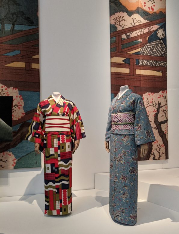
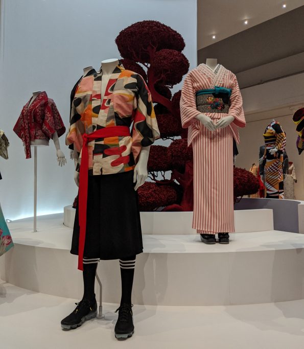
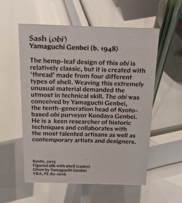
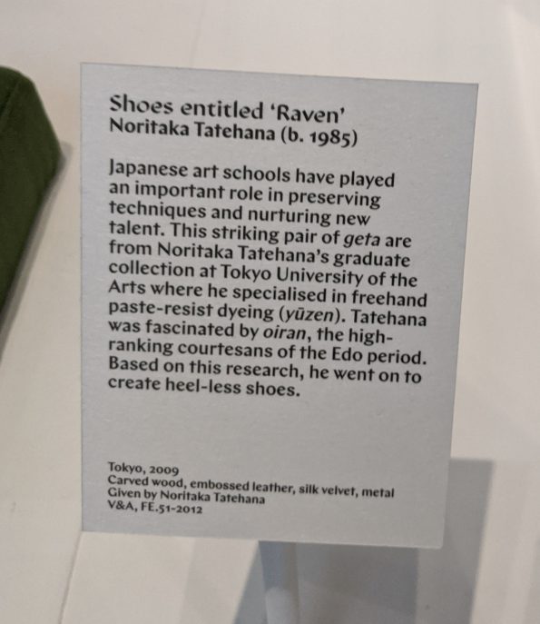
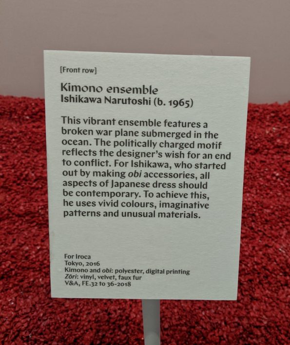
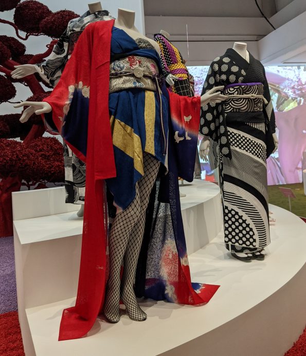
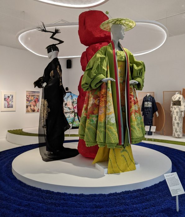
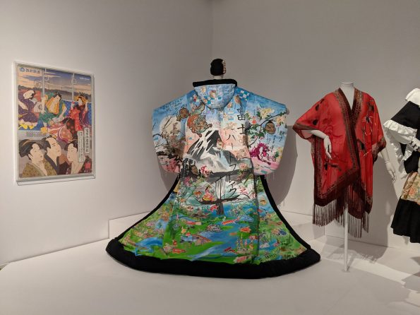
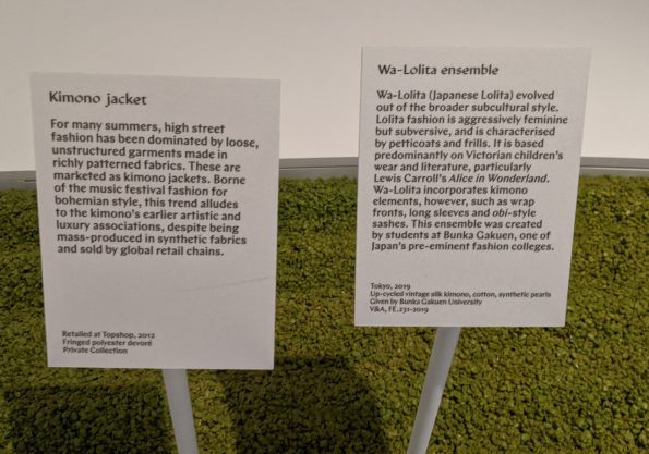
This section was an energetic, exciting extravaganza - a riot of colour and pattern emphasising a new approach to kimono that played with the very idea, meaning and purpose of these garments in contemporary Japan and beyond. Here, we also moved from the unknown craftsman to the named designer. As with the grey kimono from a previous section that was painted on the hem with a scene that could only be glimpsed when the wearer walked, there were intriguing touches on some kimono in this section. Mostly notably, fabric printed with what looks at first glance like a brightly coloured camouflage pattern, but a closer look reveals tiny samurai battling one another. South Asia found its way into this section, too, with kimono for Kikuchi Nobuko (1925-2016) made from historic chintz and obi cord from the borders of cashmere shawls.
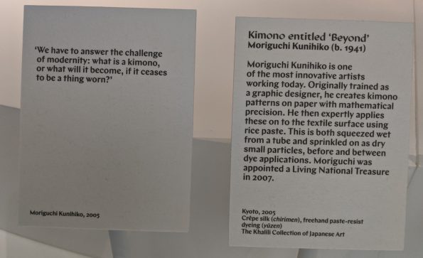
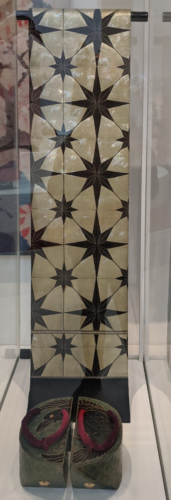
It was easy to be dazzled by the colours, textures and patterns on display, but the one that particularly drew my eye was a monochrome kimono by Moriguchi Kunihiko, one of Japan’s Living National Treasures. Interestingly, he originally trained as a graphic designer and later moved on to designing kimono. As with the silk kimono in one of the previous sections, the pattern belies the complexity of its production. The mathematically precise black and white pattern is not simply printed onto the fabric, but initially created on paper before being applied to the textile surface using rice paste and then going through multiple dye applications. There is so much more than meets the eye when it comes to kimono.
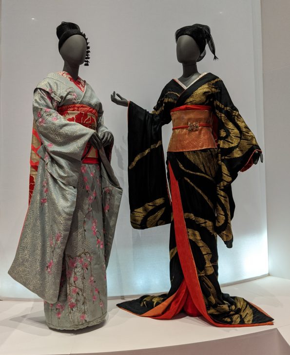
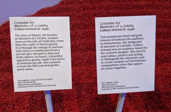
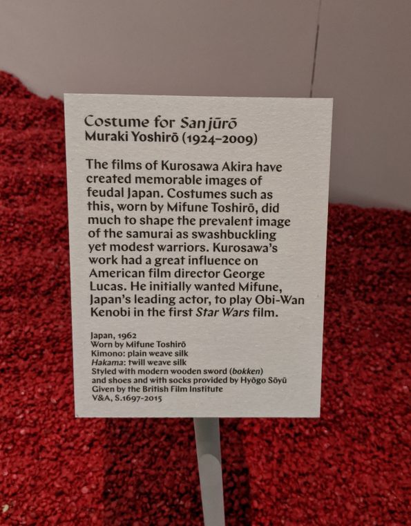
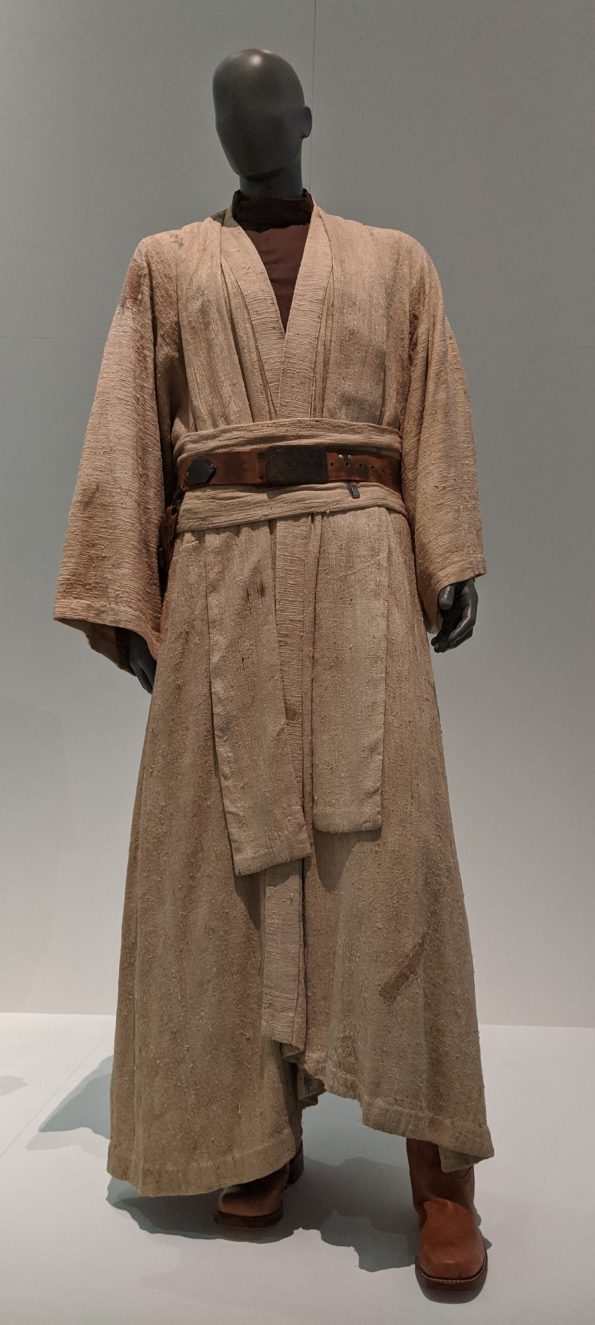
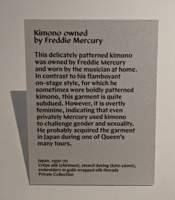
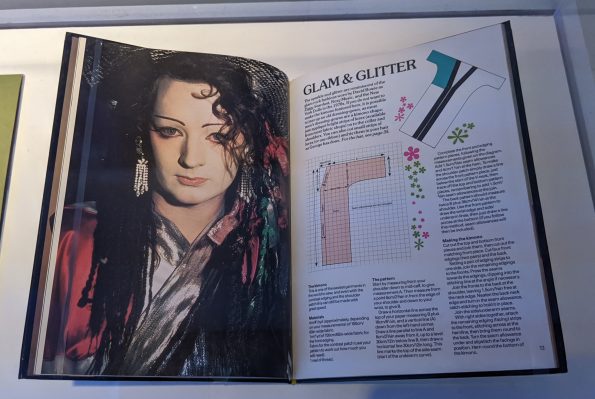
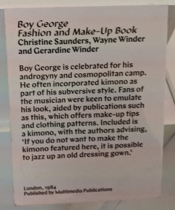
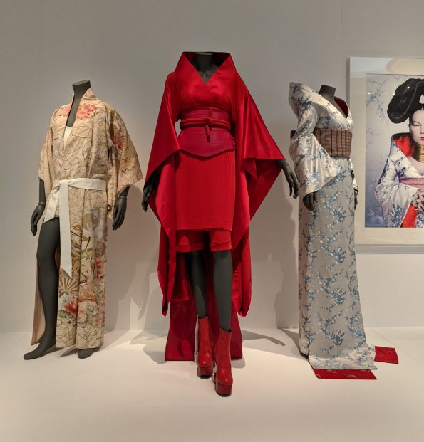
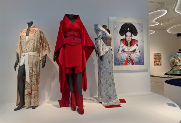
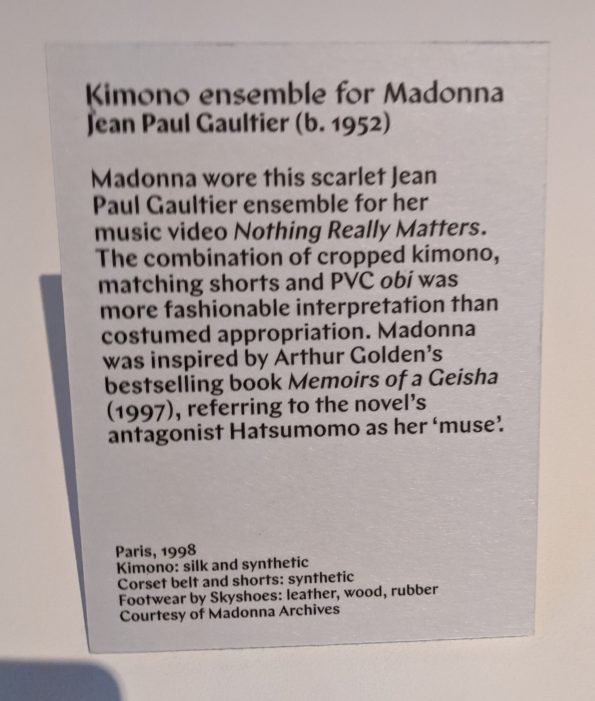
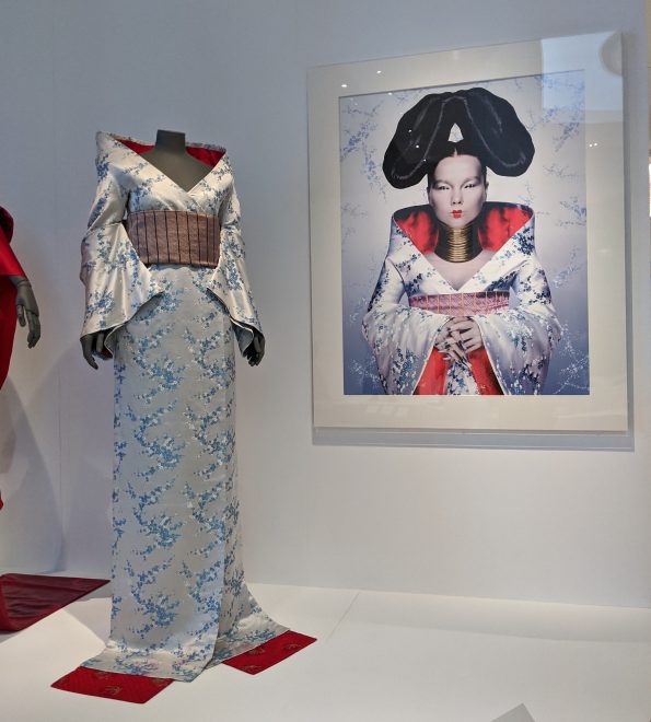
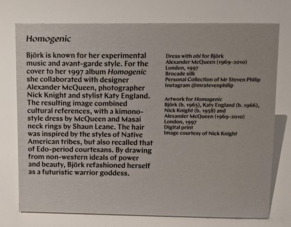
One of the many ways that people across the world have encountered kimono is through popular culture, including music and film. Seeing Madonna and Bjork’s costumes took me straight back to my teenage years, while the book about Boy George’s fashion and make-up took me back to my childhood: the first lyrics to a popular song that I memorised were ‘Karma Chameleon’. Yes, really.


The end; the beginning
And, so, we came to the end of the exhibition and parted ways with Josephine who had been a joy to spend the morning with. I wandered over to the V&A’s gift shop to buy the catalogue - something I rarely do. Today, on what happens to be the last day of the exhibition, I posted some of my photos to Instagram and then decided, on a whim, to upload them to my website. What was initially going to be a simple photo album has turned out to be an enjoyable opportunity to revisit this magnificent and enjoyable exhibition.

No Comments